Office colours for 2026: pairing wood with grey so it reads as expensive
Opening 2026, office design worldwide is still heading toward quiet luxury — richness that doesn't shout, carried by natural materials and calm colours. The pairing everyone is talking about is wood with grey, seen everywhere from five-star hotel lobbies to the headquarters of technology companies. The question is how to combine them so your office genuinely reads as expensive rather than drab and dull. Here are the combinations designers actually use.
Why wood and grey became the premium pairing
Wood grain feels warm, approachable and connected to nature; grey is calm, neutral and professional. Put them together and the wood takes the chill off the grey, while the grey makes the wood look sharper and more valuable. The pairing also makes an excellent backdrop for everything else in an office — team uniforms, brand graphics, green plants — so it dates far more slowly than a bright colour that arrives and leaves with a season.
Three combinations that work
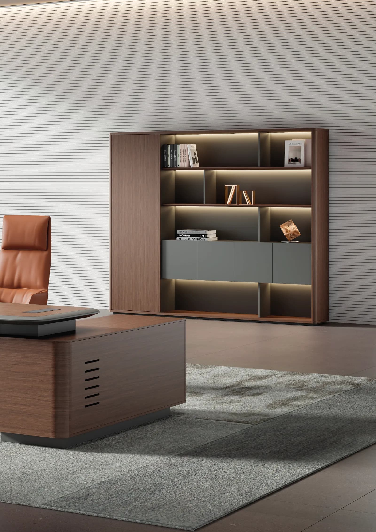
- The formal one — dark walnut against graphite grey, as in the DONARO series, for the most commanding and formal executive look
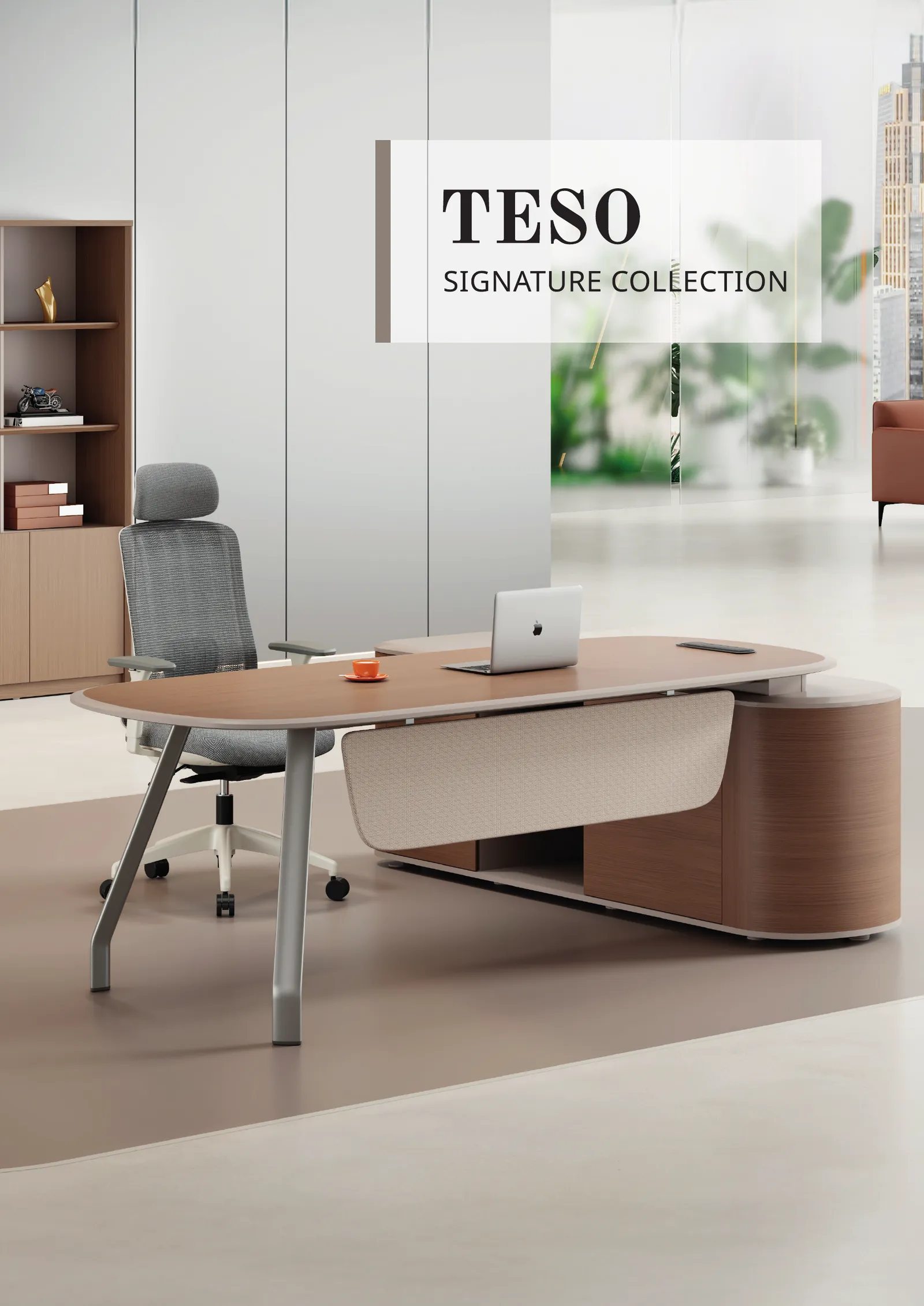
- The softer one — walnut against greige, the beige-leaning grey of the TESO series: warmer, but still dignified, and well suited to the shared working areas of a premium office
- The gentlest one — the greige and champagne with curved edges of ITALIA, or the light oak and bright beech against pale grey of FORA and VIVA, for an airy Scandinavian feel
The 60-30-10 rule for spreading colour across the floor
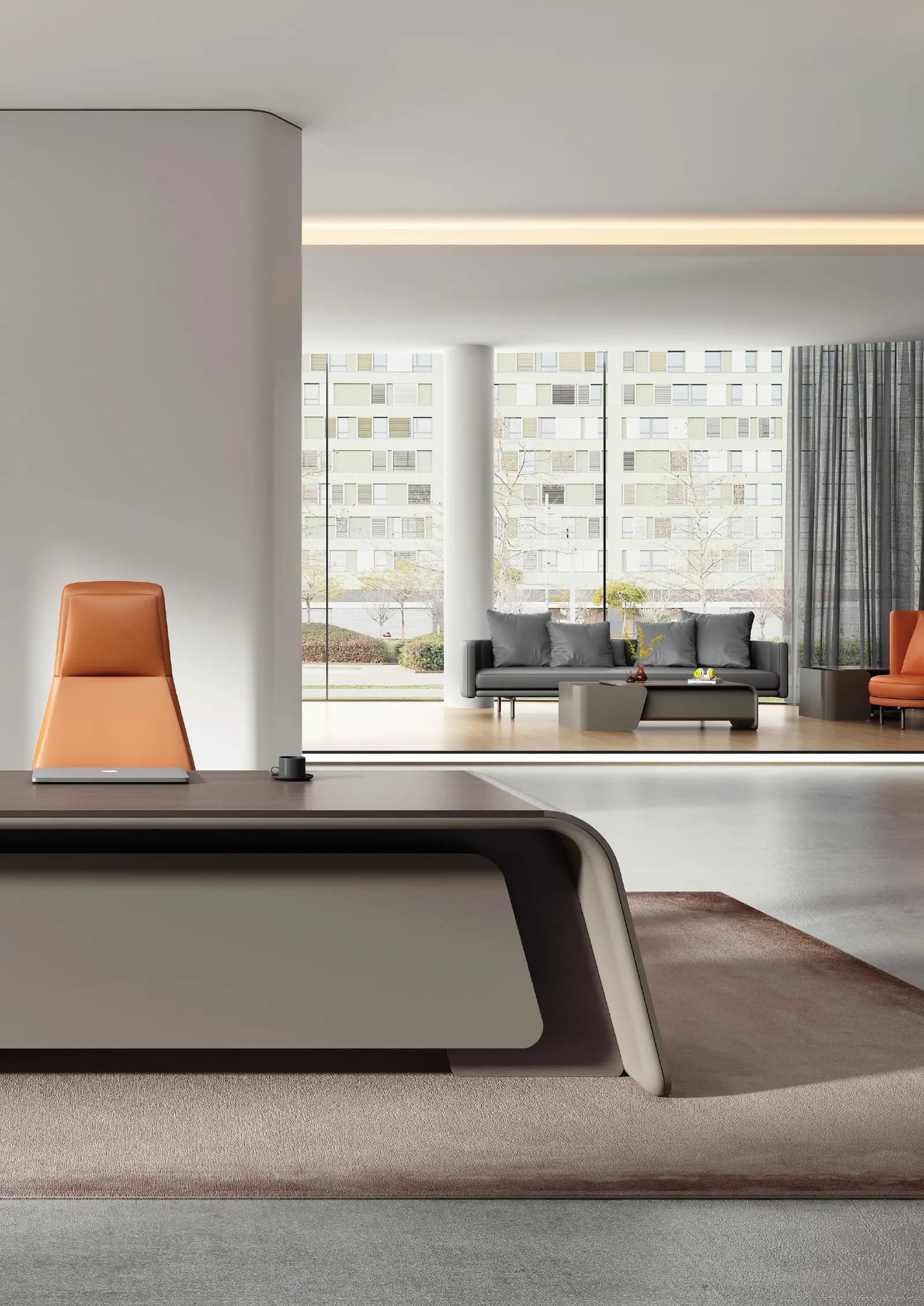
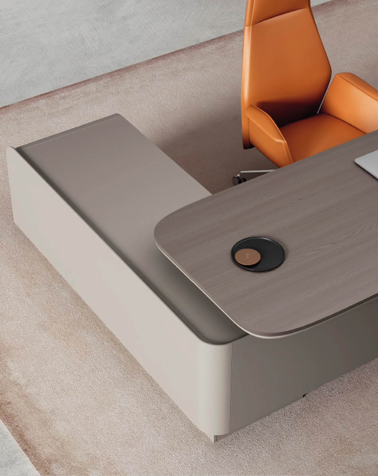
Interior designers work to a 60-30-10 split. Sixty per cent is the neutral background — off-white walls, a pale grey floor. Thirty per cent is the main furniture in wood and darker grey: desks, storage, screens. The last ten per cent is the accent, which might be a terracotta chair, a plant, or a cream bouclé fabric. The rule of thumb is simple: the bigger the object, the quieter its colour should be — then let the small things bring the life.
Texture is what decides whether it looks expensive
Two offices using the same colour pairing can look worlds apart, and the variable is the quality of the material and its surface. A good wood decor has a continuous, convincing grain — like the Schattdecor decors WORKSTATION uses across every series. A matt surface reads as richer than a reflective gloss. And mixing several textures within one zone — matt wood, matt silver metal, bouclé fabric — creates a depth the eye registers immediately as costly, without a single luxury-brand object in the room.
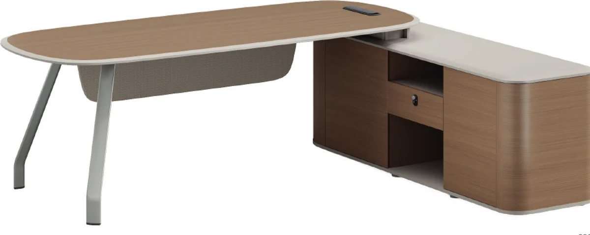
Want to see which wood and grey combination suits your brand? Talk to our design team and get a free quote at /quote or call 095-424-4166.
See the original walnut-against-graphite combination in the DONARO series, from an internationally award-winning designer.
View the DONARO seriesFrequently asked questions
Which office colours are trending in 2026?
Quiet luxury: natural wood grain paired with grey and neutrals such as greige, cream and champagne, where the richness comes from the material and its texture rather than from strong colour.
What kind of business suits a wood-and-grey office?
Almost any business that wants to look professional — law and finance through to technology and creative work. It is a neutral scheme, which means it flatters both your brand materials and however the team happens to dress.
Can I use more than one wood tone in the same office?
Yes, but keep it to two and separate them clearly by zone — dark walnut in the executive area, light oak or bright beech for the team floor — using the same grey or neutral throughout to tie the whole office together.